
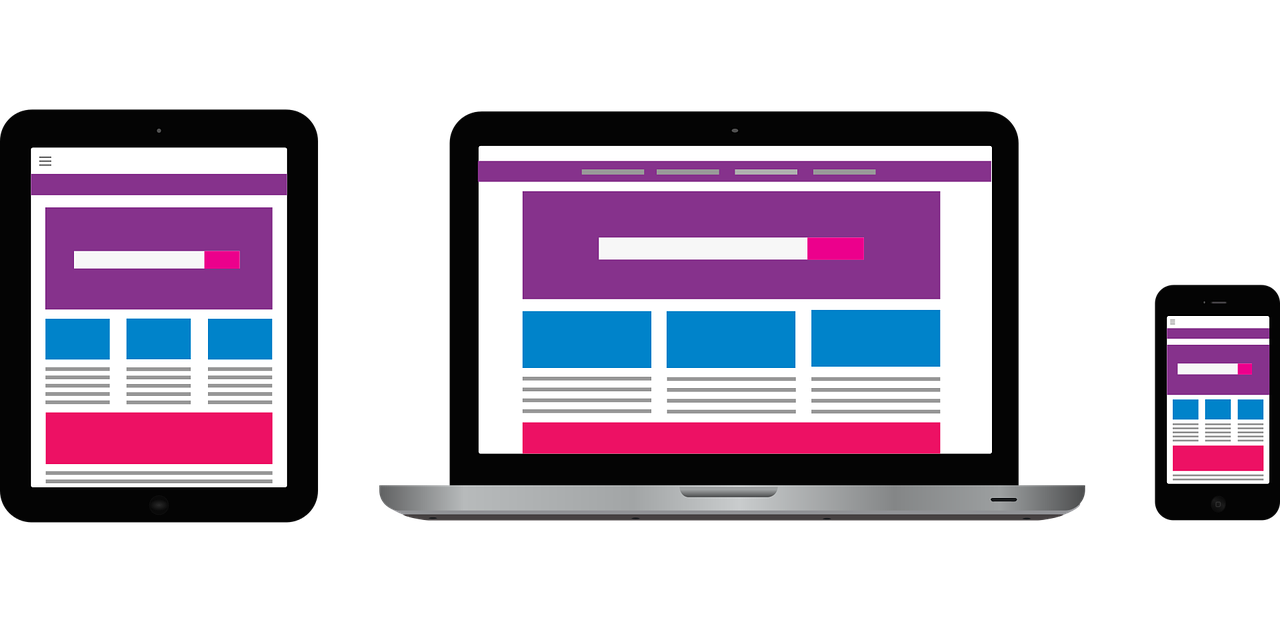
Uncover Mobile Design Opportunities
If you are like most practices, you are making website updates or redesigning your website to make improvements, but do not spend nearly enough time doing it within a mobile view. In most medical practices, most of the traffic is mobile. In some markets, it can be as high as 75 percent.
Add to this, Google’s “mobile-first” approach in its ranking algorithm and the June Page Experience Update, and it becomes clear that your website no longer has to be just mobile-friendly; it needs to be mobile-optimized.
Medical practices should create robust mobile websites where patients quickly access the information they seek and can easily communicate with you. In addition to the user benefit, slick, fast-loading mobile designs that have pages with superior engagement helps boost position on key Google search results and drives high-quality traffic.
Here are some opportunities to improve your mobile site.
Improve Mobile Site Speed
The first step in refurbishing your site is to track mobile site speed.
From an SEO perspective, site speed is a ranking factor and will likely become even more important with the Page Experience Update. Google wants to send users to reliable, quick sites. A slow site speed tests the user’s patience and may lead to higher bounce rates. This, in turn, is an indicator to Google that user may have a bad experience and lowers the value of your website and pages.
Faster pages mean a better user experience. Speed improvements let potential patients access valuable information and incentivize them to interact with your site. Faster sites may see results in the form of lower bounce rates, extended sessions, and more leads.
Use Google’s PageSpeed Insights (both mobile and desktop) to check your website’s load times and fixes.
Add a Sticky/Persistent Menu
Sticky menus (also called persistent menus) help anchor the navigation menu to the top of the mobile screen. With this feature, users locate and access the navigation menus whenever needed. This can help them search your site for additional information, provide a sense of different practice areas and make the website more accessible.
This feature helps users navigate the site with fewer taps, scrolls, and pinches.
Optimize Galleries
Not only are before and after photo galleries typically at the top of the list when it comes to most visited pages, it is also the section of your website that builds the most credibility and desire for your services.
In most cases, practices have designed their galleries to display well on desktop but have never taken the time to really experience and assess their mobile display, layout, functionality, or calls-to action. Of course, the galleries must be easy to view and navigate. Pictures, slide shows, and other effects need to be designed with the mobile screen in mind.
The mobile screen uses portrait orientation and has much less space than a desktop page. This means that the images need to be resized and treated in a different way. To optimize galleries and images, ensure that the user can see them clearly without needing to manually expand, zoom, or otherwise manipulate the screen. This helps the user access more cases and information by minimizing unnecessary hassle.
Last but not least, be sure to have a call-to-action or “next step” engagement element. Leverage the emotion and desire your gallery experience creates and strike while the iron is hot to generate more leads.
Prioritize Touch-to-Call CTAs
We all realize that telephone leads are the highest quality leads and convert into consultations more frequently than any other types of leads. At the same time, most medical websites see spikes in traffic during weekday business hours using a mobile device, particularly during lunch-time hours (11a-2p).
Smart medical practices can leverage this to their advantage by integrating phone number and “call now” elements and promotions as call-to-action buttons. These touch-to-call elements convey instantaneous communication and motivate prospective patients to act.
Not only are phone calls more valuable for your practice, touch-to-call actions are much more convenient for mobile visitors than filling out forms using a small screen and keyboard. Let them hit the “Easy” button.
Incorporate Instant Communication
Although we want more visitors to call, many visitors prefer to initially communicate with businesses and practices digitally. This is particularly true with Millennials and online users that have grown up with mobile technology.
To capture the maximum number of leads, consider investing in a robust 24/7 Live Chat or text messaging service for your website visitors. This lets your guests instantly interact with an online representative whether it is their preference, at a time when they prefer not to speak out loud, or after hours and weekends when your office is closed.
We have seen practices implement instant digital engagement elements, such as Live Chat on their website and pay-per-click landing pages and experience a 25 to 40+ percent increase in their lead volume.
Things to Consider for Mobile Design Optimization
If you have not recently done a thorough audit of your website on your mobile device, it may be the most productive activity you do to improve your digital marketing results. Be critical and creative to uncover:
- How quickly your website loads
- Strategies to improve navigation and get visitors to primary destination pages/sections
- Layout and display issues that undermine your website’s credibility
- Opportunities to increase lead generation and conversions
- Your content’s readability with a smaller screen
- Ways to keep visitors more engaged and on your site longer
These mobile improvements will help you create a better user experience and convert more leads from the traffic you are already attracting. It will also send the right signals to Google, which is relying more and more on your mobile visitors’ experience as a ranking factor.

[MedShark] is always available and responsive. They have helped improve our website layout and SEO rankings and I recommend MedShark for a Plastic Surgery and Med Spa practice. Bill is available if I need him and Julia - our Account...
MedShark has done an amazing job for my two dental offices! Jonnie and Cole have great expertise and knowledge and truly took care of my companies, like it’s their own! Really recommend them highly! Thank you, and cannot wait to...
What I love about MedShark is their ability to execute in a timely manner. When I request an edit to our website, it is up within a couple days! Sara is the strategist supporting our account and I appreciate that...
My account manager Julia is spectacular! I am very very particular and they take great effort to make things look perfect. They are also extremely good at helping to explain the ever-changing process of SEO and web design.
A great friend, Bill Fukui introduced me to BluShark and MedShark. Thank you Bill! My experience has been mostly through John (head of client success). We have a common client that they have helped. John is so responsive and helpful....
Redoing a website is never easy, but John and Bill have more than exceeded my expectations. John’s weekly communication kept the project moving forward. When I would “change my mind” and decide on a different direction, he never blinked…he just...
The team at MedShark has been very good to work with. They deliver work product on time, work with you to develop your unique voice/brand, are always available, and have keen insight into helping your practice grow. They are on...
Our Awards